
Most small businesses in Nepal that try ads blame the platform when results are poor. The ad gets clicks, the budget disappears, and nobody calls. Very often the ad did its job and the page behind it did not. A landing page is simply the first page a person sees after tapping your ad, and it decides whether that tap was worth paying for.
This guide is a practical checklist for that page. It works whether you send people to a full website, a single product page, or a simple one-page site. If you have not launched your first campaign yet, read our guide to setting up your first Google Ads Search campaign alongside this one.
What a landing page actually is (and what it is not)
A landing page is whichever page a visitor arrives on. It can be your homepage, but it usually should not be. A homepage has to speak to everyone: new visitors, existing customers, job seekers, suppliers. That is exactly why it works poorly for ads, where you paid to reach one specific person with one specific need.
Google describes landing page experience as a measure of how relevant and useful your landing page is likely to be to people who click your ad. In Google Ads Help, it says pages with higher ratings are usually well organized and have text that relates to a person's search terms. So the page matters twice: it affects whether visitors act, and Google rates it for Search ads.
Facebook and Instagram ads work differently, but the human problem is the same. Someone saw a photo or a short video, got curious, tapped, and now decides in a few seconds whether to stay.
Step 1: Give the page one job
Before you design anything, write one sentence: "After visiting this page, a person should ___." Fill the blank with a single action.
- Call the shop
- Send a WhatsApp message
- Fill a short enquiry form
- Visit the store (with a map and hours visible)
When a page tries to do five things, visitors do none. Remove the blog links, the social media icons that lead away from the page, and the long menu. You do not need to strip everything, but every link that does not support your single goal is a reason to leave.
Pick the action that suits how your customers already behave. In Nepal, many buyers prefer to message first and ask about price on chat. If that is your customer, a clear WhatsApp button will usually serve better than a form. Our WhatsApp Business app setup guide covers how to set up the chat side so the reply is fast and professional.
Step 2: Match the page to the ad
This is the most common failure. The ad promises one thing and the page delivers something vaguer.
Picture a shop that runs an ad for "winter jackets, delivery in Birgunj" and sends the click to the homepage. The visitor sees a banner about electronics, a menu with twelve categories, and no jacket in sight. They leave. The ad was fine. The click was wasted.
Now picture the same shop sending that click to a page titled "Winter jackets, delivery in Birgunj", with the jackets, prices, and a message button right there. Same ad, same budget, very different outcome.
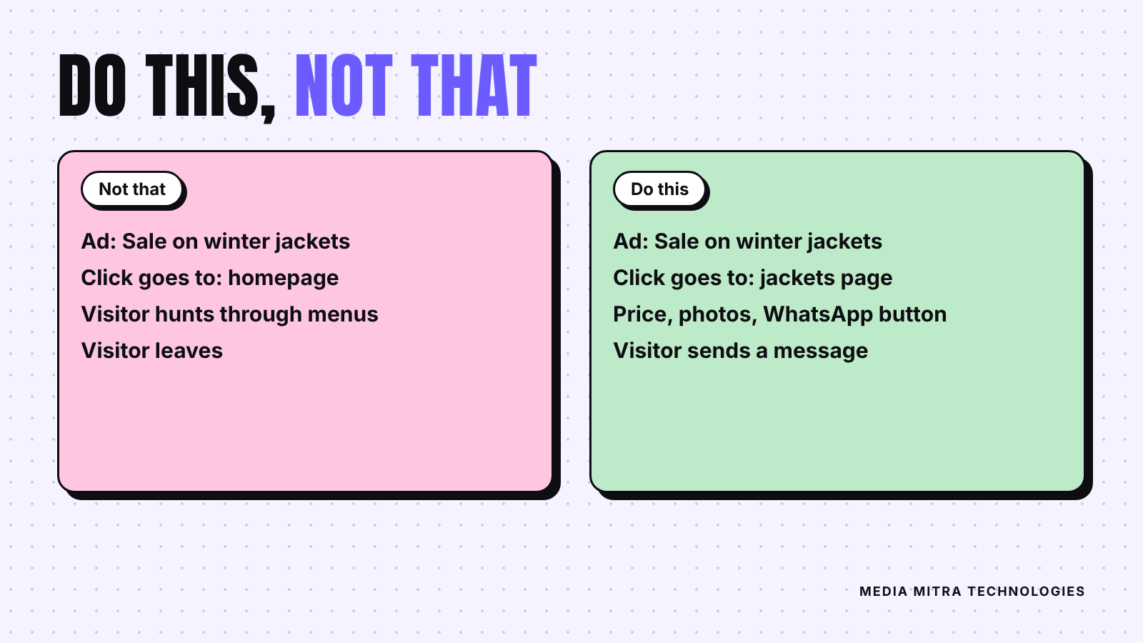
A simple matching rule
Check three things line by line:
- Headline: the main heading uses the same words as the ad.
- Offer: if the ad says a price, discount or delivery area, the page shows it in the first screen.
- Image: the picture on the page looks like the picture or the product in the ad.
For Google Search ads, also make sure the page text naturally includes the words people searched for. Google's own help page says well-rated pages have text that relates to a person's search terms, so a page built around one service beats a generic page that mentions it once.
Step 3: Make it fast on a phone
Plenty of ad traffic arrives on phones, and not always on a strong connection. A page that takes too long to show its main content loses people before they read a word.
Google's web.dev defines three Core Web Vitals and their "good" thresholds, measured at the 75th percentile of page views:
| Metric | What it measures | Good threshold |
|---|---|---|
| LCP (Largest Contentful Paint) | How fast the main content appears | 2.5 seconds or less |
| INP (Interaction to Next Paint) | How quickly the page responds to taps | 200 milliseconds or less |
| CLS (Cumulative Layout Shift) | How much the layout jumps around | 0.1 or less |
You do not need to become a performance engineer. The practical fixes are usually the same few things: compress your photos before uploading them, avoid auto-playing videos at the top, and remove plugins you do not use. We cover this in more detail in our Core Web Vitals guide for small business websites.
Test the page on your own phone using mobile data, not office Wi-Fi. If you feel yourself waiting, so does the customer.
Step 4: Show proof that you are real
A visitor from an ad does not know you. A tap costs them nothing, so trust has to be earned quickly. Put proof near the top, not buried in the footer:
- A real shop photo or a photo of your team, not a stock image
- Your actual address, phone number and opening hours
- Customer reviews. If you have a Google profile with reviews, show them. Our guide on getting more Google reviews explains how to collect them honestly
- Clear prices or a price range, even if the final quote varies
- Delivery, return or warranty terms in plain words
Only show proof that is true. Use real photos of real work and quote only reviews customers actually wrote. Invented testimonials damage a small business faster than any bad ad.
Step 5: Make contacting you effortless
Look at the first screen on a phone, with no scrolling. Can you see what you offer and how to contact you? If the button is below three paragraphs, move it up.
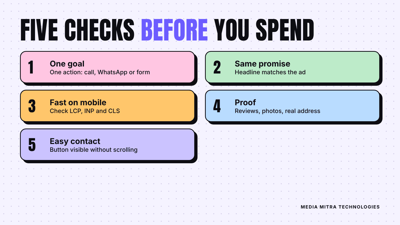
Some details that help:
- Use a button that says what happens next, such as "Message us on WhatsApp" instead of "Submit".
- Keep forms short: name, phone number, and one question is usually enough.
- Make phone numbers tappable so one touch starts a call.
- Repeat the button after the main content so a visitor who reads to the bottom does not have to scroll back.
- Reply quickly. A perfect page is wasted if enquiries wait a day for an answer.
Step 6: Track what the page does
Without tracking, you will not know whether the page works or the ad works. At minimum, count the actions you care about: button taps, form submissions, calls. Our guide to GA4 key events for small businesses shows what to track and how to set it up.
Then change one thing at a time. If you rewrite the headline, swap the photo, and move the button all at once, you will never learn which change helped. Run the new version for a couple of weeks and compare it with the old one before changing anything else.
If you are still choosing between boosting a post and using the full ad tools, read Boost Post vs Ads Manager. Either way, the destination of the click deserves the same care as the ad itself.
Frequently Asked Questions
Can my homepage be my landing page?
It can, but it rarely performs best. A homepage serves many audiences. A page that repeats the ad's offer and gives one next step usually converts better. If you have a very small business with one core service, your homepage may already be close to that.
Do I need a separate landing page for every ad?
Not for every ad, but for every distinct offer or service. Three ads about the same jacket collection can share a page. An ad about shoes needs its own.
Is a WhatsApp link enough as a landing page?
For some businesses, sending people straight into a chat works. The risk is that the visitor sees no proof, price or photos before messaging, so you spend more time answering basic questions. A short page with the essentials, plus the chat button, usually filters better.
How do I know if my landing page is the problem?
If your ads get clicks but few calls, messages or forms, the page is the first place to look. Check the five points above, then compare the clicks in your ad account with the actions you track.
Conclusion
A landing page does not need to be fancy. It needs one goal, a headline that matches the ad, quick loading on a phone, honest proof, and an obvious way to get in touch. Fix those five things before you raise your ad budget, because the same money will bring more enquiries.
If you would like a second pair of eyes on your page or want us to build one that fits your campaign, get in touch with Media Mitra and we will tell you plainly what to fix first.
Sources: Google Ads Help: Landing page experience and web.dev: How the Core Web Vitals metrics thresholds were defined.