
Most small businesses in Nepal do not have a branding problem. They have a consistency problem. The logo is fine, but the Facebook cover uses a different blue, the signboard uses a different font, the printed menu uses a third style, and the website looks like it belongs to someone else's shop. Customers never think "this brand is inconsistent." They just feel a faint doubt about whether you are a serious business.
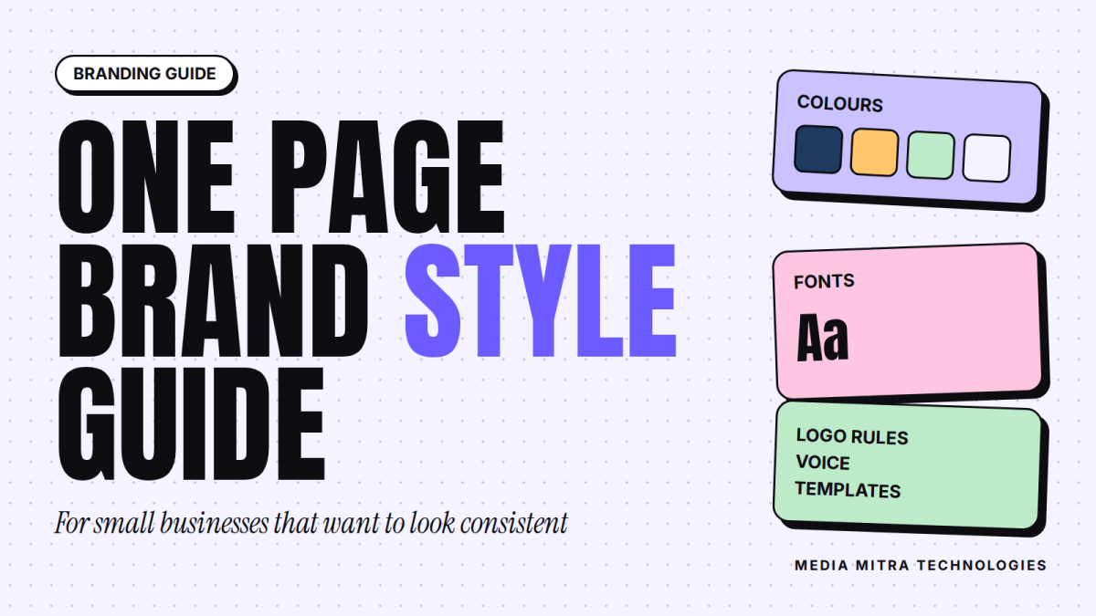
A brand style guide fixes that. It is a short document that says, in plain terms, how your business looks and sounds everywhere. For a small business, it should fit on one page. You do not need a 60-page PDF from an agency. You need a reference that your designer, your nephew who edits Reels, your printer and your future staff can all open and follow.
This guide walks through what goes into a one-page brand style guide for a small business, how to choose each element, and the mistakes we see most often.
What a Brand Style Guide Actually Is (and Is Not)
A brand style guide is a rulebook for decisions you would otherwise make again and again: which colour for the button, which font for the offer poster, how to write a caption, where the logo goes on a photo.
It is not the same as your logo. A logo is one asset. A style guide is the system around it. It is also not a marketing strategy. It will not tell you what to post or how much to spend on ads. What it does is make everything you publish look and sound like it came from one business, which makes every other piece of marketing work a little harder.
Who needs one
If more than one person ever touches your design or content, you need one. That includes a shop owner who posts on Facebook and also hires a freelancer for festival offers. It includes a restaurant with a printed menu, a Facebook page and a delivery partner listing. Even a solo founder benefits, because in six months you will not remember which shade of green you used.
The one-page rule
Keep it to one page on purpose. A guide nobody reads is worse than no guide. If a rule cannot be explained in a line or two, it is probably too fussy for a small business.
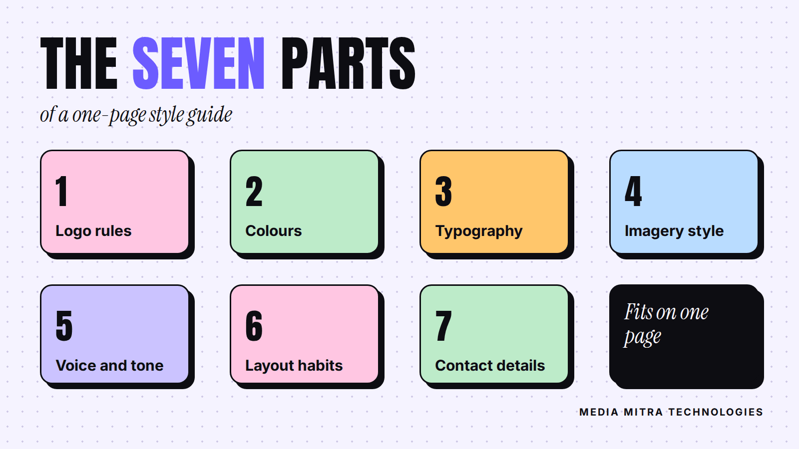
The Seven Elements of a One-Page Style Guide
Here is the structure we recommend. Each element takes about ten to thirty minutes to decide if you already have a logo.
1. Logo rules
Save your logo in a few versions: full colour, one colour (black or white), and a square or icon version for profile pictures. Then write three rules:
- Minimum size, so it never becomes unreadable on a small phone screen.
- Clear space, roughly the height of one letter from your logo around all sides.
- What not to do: no stretching, no new colours, no busy photo behind it.
2. Colour palette
Pick one primary colour, one or two secondary colours, and neutrals (a dark ink colour and a light background). Write down the exact HEX codes, for example #1F3A5F, not "dark blue." HEX codes are what designers and website builders actually need.
Use a simple split as a guide: mostly neutrals, a good amount of the primary colour, and a small touch of an accent colour for buttons and highlights. If everything is a bright colour, nothing stands out.
3. Typography
Choose two fonts at most: one for headlines and one for body text. Write down the names, the weights, and where each is used. Two is enough. A third font usually appears because someone found something pretty on a free site, and soon your posters look like a ransom note.
If your content is in Nepali as well as English, test your fonts in both scripts. Many display fonts only support Latin letters, so Devanagari text silently falls back to a default font and looks mismatched. Pick a Devanagari-friendly font for Nepali text and note it in the guide. Also check the licence of any font you use commercially, especially if you downloaded it from a random site.
4. Imagery style
Describe your photos in one sentence. "Bright natural light, real products on real shelves, no stock photos of people shaking hands." This one line saves hours of back and forth with whoever shoots or edits your content. If you shoot video, the same applies. Our article on why Birgunj brands should switch to Reels covers how video fits into a brand's visual identity.
5. Voice and tone
Write three adjectives and one example each. For instance:
- Friendly, not casual: "Thanks for your order, it is on the way," not "Yo, order done."
- Clear, not clever: say the price and the delivery area plainly.
- Respectful in both languages: decide whether you use "tapai" style politeness in Nepali, and stick to it.
Also decide how you mix Nepali, Romanised Nepali and English. Many Nepali brands switch between all three randomly, which reads as unplanned. Pick a default and say when you break it.
6. Layout habits
Note a few repeatable habits: where the logo sits on social posts (say, bottom right), how much margin you leave around text, and one standard template for offers and one for announcements. Templates are the secret weapon here. Once you have two or three good ones in Canva or Photoshop, anyone can produce on-brand posts in minutes.
7. Contact and legal details
List your business name as it should be written, your phone number format, address, social handles and website. It sounds trivial, but a business that writes its phone number three different ways on three platforms looks careless, and it hurts local search listings too, where consistent details matter.
Choosing Colours That Customers Can Actually Read
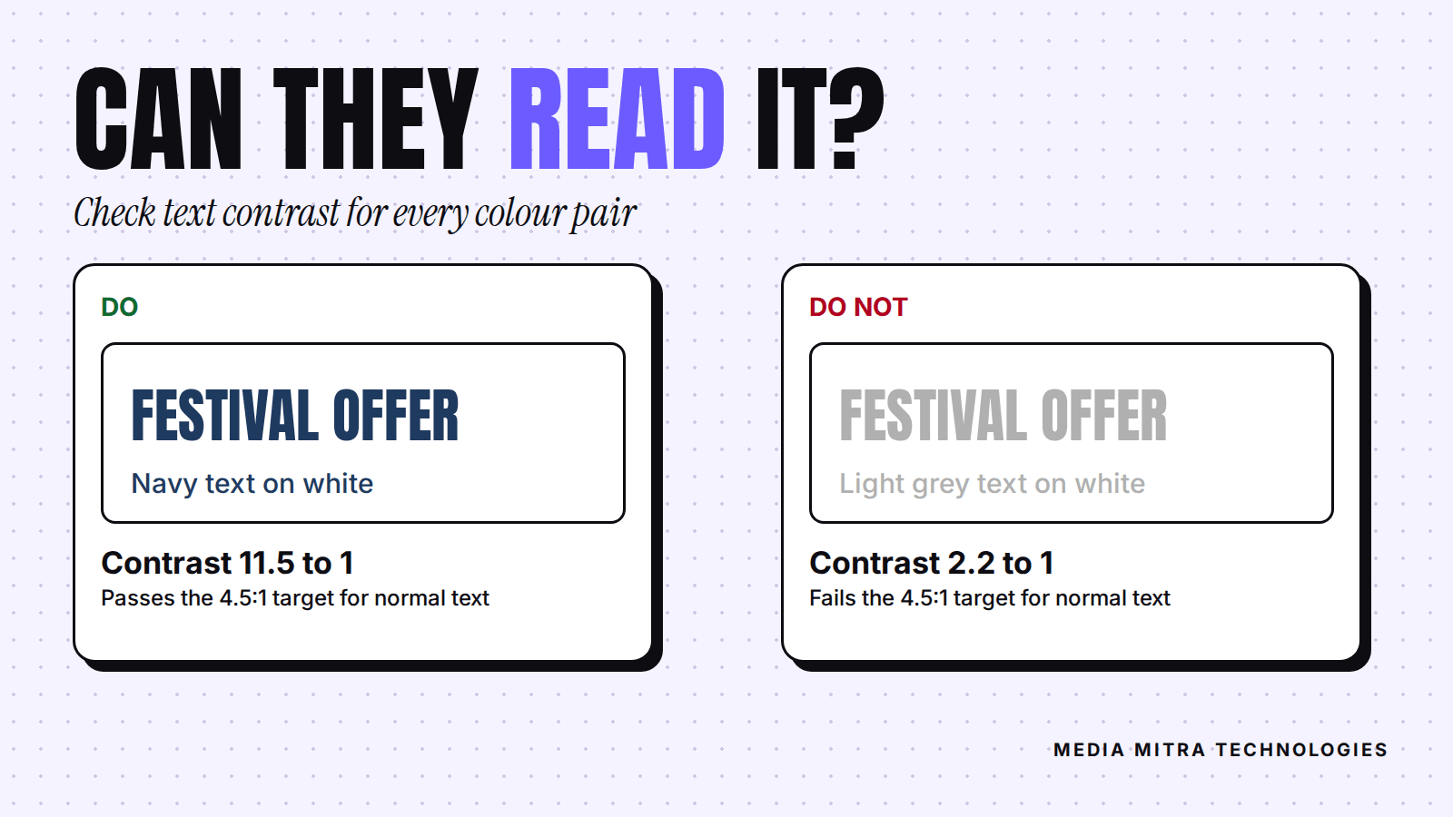
This is the part most small businesses get wrong, and it is where a style guide earns its keep. A pretty palette is useless if text on it cannot be read in daylight on a cheap phone.
The Web Content Accessibility Guidelines (WCAG) from the W3C set a clear benchmark. For Level AA, normal-size text needs a contrast ratio of at least 4.5:1 against its background. Large text, defined as at least 18 point or 14 point bold, needs at least 3:1. You can read the full explanation in the W3C's Understanding Success Criterion 1.4.3.
You do not need to be a designer to use this. Free contrast checkers let you paste two HEX codes and tell you the ratio. Do this check for every text and background pair in your palette, and record the safe pairings in your guide.
Common failures
- Light grey text on white, because it "looks elegant."
- Yellow or light orange text on a white background.
- White text over a busy photo with no overlay.
- Red text on a dark blue background, which vibrates and tires the eye.
A simple fix: pick one dark ink colour for text and one light background, and treat your bright brand colour as a fill for buttons and shapes, not for paragraphs.
A Simple Process to Build Yours This Week
You can finish a first version in one focused afternoon. Picture a small furniture showroom that currently posts offer posters in five different styles. Here is what the owner could do.
- Collect. Put every poster, signboard photo, menu, bill book and social profile in one folder. See what you actually use.
- Spot the winners. Circle the two or three pieces that look best and got the best response. Those are your reference points.
- Decide the basics. Choose the palette and two fonts based on those winners and your logo, and run the contrast check.
- Write the voice rules. Three adjectives, three examples.
- Build two templates. One for offers, one for announcements.
- Put it on one page. Share it as a PDF with everyone who makes content for you, and keep the editable version somewhere safe.
If you are also planning a website, the style guide becomes the input your developer needs. Our website brief template shows what else to prepare, and it is much easier to fill in once your brand basics are written down. And if your current site is not bringing in customers, these common reasons Nepali business websites fail often include inconsistent branding.
Mistakes to Avoid
- Copying a big brand. A national brand's guide is built for a team of fifty. Borrow the idea, not the complexity.
- Changing everything every festival. Seasonal graphics are fine, but keep colours and fonts anchored to the guide.
- Never updating it. Review it once or twice a year. If a rule is constantly broken, either the rule or the habit needs to change.
- Keeping it in one person's head. If only your designer knows the rules, you do not have a guide, you have a dependency.
- Over-designing. If your customers mostly see you on a phone, optimise for a small screen first.
Frequently Asked Questions
How long should a brand style guide be for a small business?
One page is enough to start. Cover the logo, colours, fonts, imagery, voice and contact details. You can add detail later as your team and channels grow.
Do I need a logo before I make a style guide?
It helps, but you can start without one. Decide your colours, fonts and voice first, then let the logo follow the system. If your logo is weak or unreadable, fix it before spending on printing.
Which tool should I use to make the guide?
Anything that exports a clean PDF works: Canva, Google Docs, PowerPoint or Figma. The tool matters far less than keeping the document short and sharing it with everyone who makes content for you.
How many colours should a small business brand use?
Typically one primary colour, one or two secondary colours, and a dark and light neutral. More than that, and your designs get harder to keep consistent.
Should my guide cover Nepali and English text?
Yes, if you publish in both. Name a font that renders Devanagari properly, and decide when you write in Nepali, English or both.
How often should I update it?
Review once or twice a year, or when you launch a new channel such as a website or a new platform. Keep old versions so you can see what changed.
Conclusion
A brand style guide is one of the cheapest and least glamorous things you can do for your marketing, and it quietly improves everything else. Posts look cleaner, ads feel more trustworthy, and your team stops asking "which blue was it?" Start with the seven elements, check your text contrast, build two templates and share the page with everyone who touches your content.
If you would rather have an experienced team shape your brand system, design the templates and apply it across your website and social channels, we are happy to help. Get in touch with Media Mitra Technologies and tell us about your business.